Improve website performance is a strong point in user experience term, simply because anyone likes wasting time waiting for a page to load. Based on this assumption, I will be showing in this post front-end techniques to reduce the weight of images in our websites.
# Tip 1: Fluid Images
When handling with responsive images, we certainly want support visual quality combined with performance. To reach this goal we need consider different images based on user devices.
The simplest way to succeed with this technique is through CSS3 media queries:
/*---------------
 common devices
-----------------*/
.picture {
    background-image: url(foo-small.png);
}

@media only screen and (min-width: 768px) {
    .picture {
        background-image: url(foo.png);
    }
}

/*------------------
  device pixel ratio
--------------------*/
.logo {
    background-image: url(logo.png);
}

@media (resolution: 2dppx) {
    .logo {
        background-image: url(logo@2x.png);
    }
}
In the code snippet above, we first start with an image for mobile devices and later on we define an image with a better resolution for larger devices. We can also be handling retina devices as shown above.
The advantage of this approach is that we provide more speed based on the platform the user is on and without relying to any third-party libraries, it’s just the beauty of CSS ❤.
Modern Browsers and Polyfills
There are frameworks as alternatives, like Picturefill which allows us define elements and attributes with the file name you want to load, e.g:
srcset attribute: it allows us to fill a set of srcs
<img src="logo.png"
  srcset="logo-hd.png 2x, logo.png 1x">
picture element: we can specify media queries to be served by different devices
<picture alt="Title">
  <source src="content-image.jpeg">
  <source media="(min-width: 768px)" src="content-image-lg.jpg">
</picture>
# Tip 2: Reduce HTTP 1.1 Requests
If you concern about HTTP 1 protocol then you need to be aware about decreased number of requests due to bottlenecks on the latency (RTT), especially on mobile devices due to RCC approach. I will not delve into these concepts here to avoid tiring and widespread reading, but I recommend that you research these issues better.
What we will se now are some techniques to decrease the number of HTTP requests to quicken page load times.
1. Inline Resources
This is a technique to reduce the number of requests from files (HTML, SVG, CSS or JS) and for small images too, like logos or icons, these are files with the size of about 1, 2 or 3 KB. Keep in mind that in these cases, the cost of making a new request for a resource is much higher due to latency.
Base64 encoded images
There are several tools performing this kind of optimization, like Base64-image which makes conversion of a image and later on provides a embed encoding string to be used in css properties or img elements as shown below.
<img src="data:image/png;base64,iVBORw0KGgoAA">
To avoid needlessly complex files, we can also have that same result with Sass/Compass, as shown below:
@mixin encoded-image($url) {
  background-image: inline-image($url);
}
In conclusion, you might be wondering is that when we put something directly in a HTML file, it means that every page will have to download this resource again, right? What would be the ideal size for a HTML file though?
This question is related to TCP segment size (~1.4 K) and the TCP initial size (10), so if we multiply these two values we will understand that the ideal size for a HTML file is less than 14 KB, it is a HTML file with gzip and all built.
2. Sprites
When dealing with static resources such as CSS or JS we can decrease the number of requests of these files using concatenation aproach. Following up this technique, we can concatenate images in the same way we do with css/js files. However, concatenate images is not so simple, but it is possible. The concatenation of images is also called sprite.
We could use Photoshop to concatenate images, however we can automate this task with ImageMagick CLI by following the command bellow:
$ convert src/assets/img/*.png -append dist/assets/img/sprite.png
At this moment we need make use of the generated file and apply a unique background through a browser developer tool and adapt a background-position for each corresponding picture:
.icon {
  background: url('img/sprite.png') no-repeat;
  width: 18px;
  height: 18px;
}

.icon-twitter {
  background-position: -5px -5px;
}
.icon-git {
  background-position: -33px -5px;
}
This seems hard work to be done but some developers choose this approach instead of looking for some automation tool because the css inside can be somewhat complicated when generated. This is a personal method, so if you prefer a tool for handling this task you can make use of Sprity plugin and adapt with some task manager or then use the CLI as shown below:
  # automatically finds the coordinates for us:
  $ sprity out/ images/*.png -s style.css
There’s another alternative for handling sprites if you are using Sass/Compass, with the CSS Sprite helper make it easier to build and to work with css sprites. For example:
@import "compass"

/* This will generate a css sprite map and return a reference to it */
$icons: sprite-map("icons/*.png")
background: $icons

/* For each sprite in the css sprite map you can set the position
  for the original image in the sprite names within the supplied map */
@each $i in sprite_names($icons)
    .icon-#{$i}
      background-position: $sprite-position($icons, $i)
      +sprite-dimensions($icons, $i)
# Tip 3: Deferring Images
Defer images is certainly a great choice to be applied for faster pages, the idea behind this technique is to prioritize the loading of essential resources (css, js), avoiding concurrence with images or other heavier resources that blocks the rendering such as scripts, iframes, etc. Basically then, a deferred image is downloaded after the initial page load.
# Tip 4: Compressive Images
This technique comes from reducing the image size by considering things like unnecessary metadata, optimization mode (lossy, lossless) balancing quality and small file size. There are several tools that perform this kind of task, one of them is the popular TinyPNG.
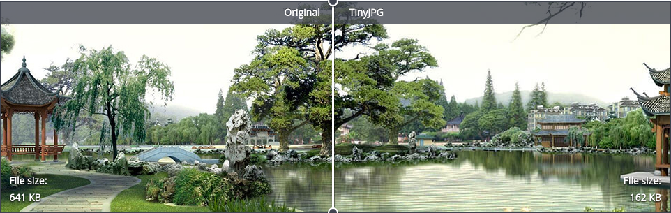
As we can see, the file size from their showcase is reduced by more than 70% from the original file with a perfect balance in quality. But do not stop here, there are other great tools that you can enjoy, as shown below:
Online Tools:
Desktop:
- ImageOptim - Mac
- RIOT - Windows
CLI: